— Ideas & inspiration
Public space composition
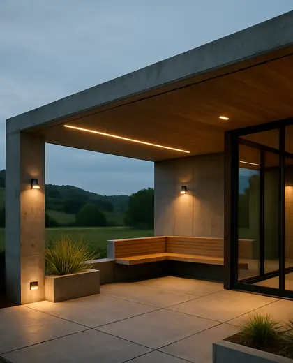
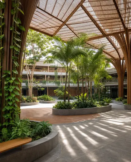
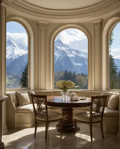
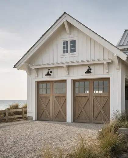
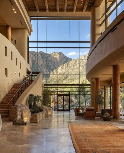
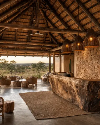
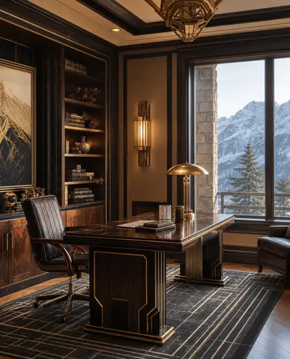
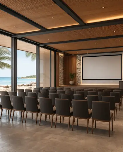
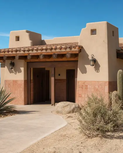
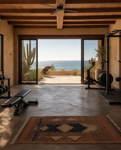
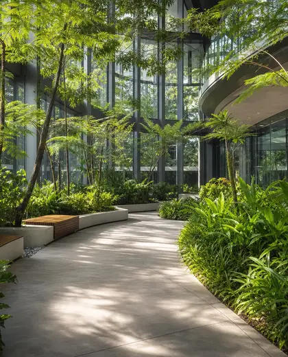
Public space composition is defined by durable, high-traffic materials such as concrete, stone, metal, and timber, often paired with weather-resistant finishes. The palette is usually restrained: greys, neutrals, black, warm wood tones, and occasional muted color accents for wayfinding or seating. Its defining elements are open circulation, clear edges, seating, lighting, planting, and surface changes that organize movement and gathering.
- public space
— References
References to explore
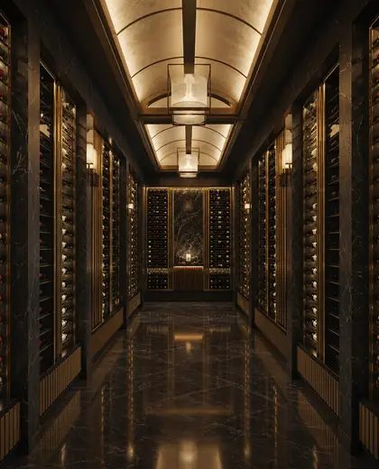
What makes a public space design feel durable?
Durability usually comes from robust surfaces, strong edge details, corrosion-resistant metals, and materials that age well under heavy foot traffic and weather exposure.
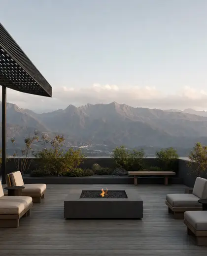
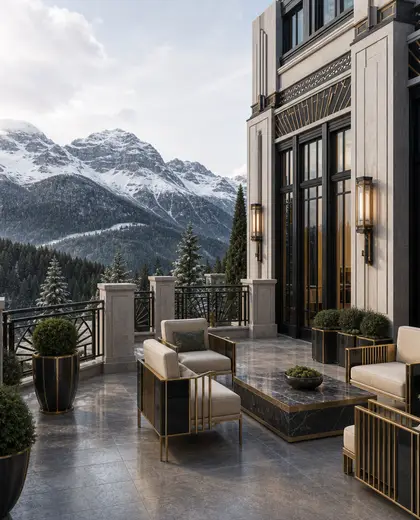
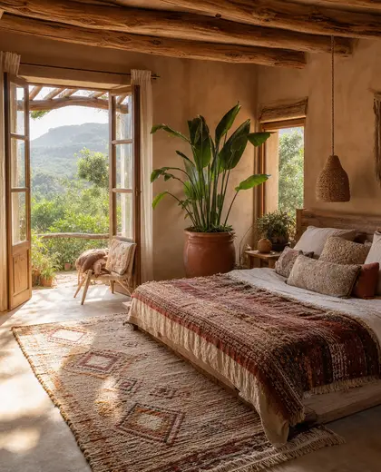
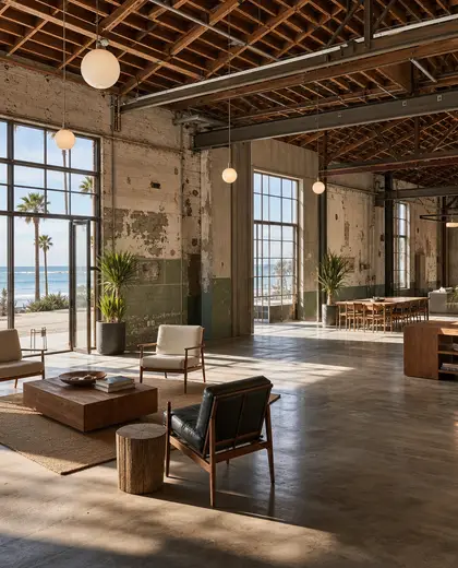
Can public space composition still feel warm and inviting?
Yes. Warmth often comes from timber, planting, softer seating, layered lighting, and changes in texture rather than bright color alone.
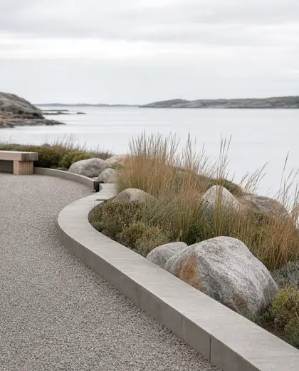
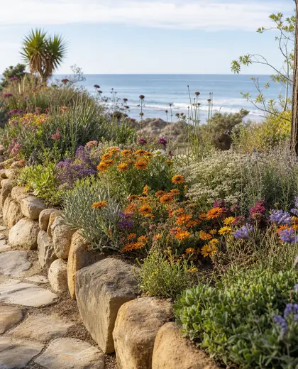
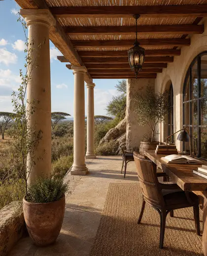
What should I avoid in a public space composition?
Avoid overly delicate finishes, slippery surfaces, and too many competing materials. Public spaces work best when the palette is consistent and the layout is easy to read.
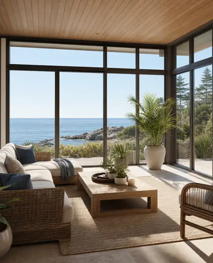
— The style
What defines it
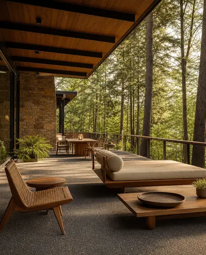
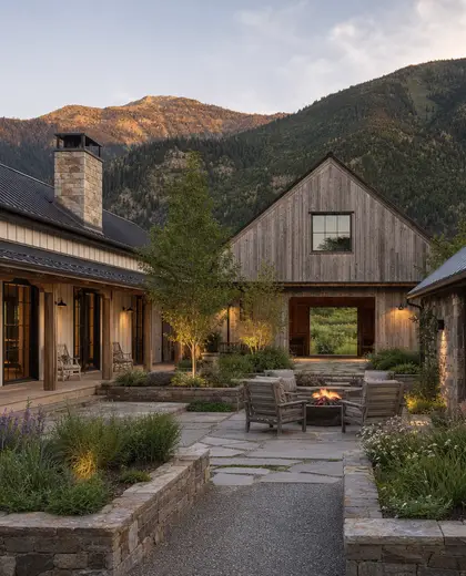
Concrete paving, natural stone, brick, steel, aluminum, timber slats, and hard-wearing composite finishes.
Mostly neutral and low-contrast: grey, sand, charcoal, black, and weathered wood, with small accent colors for signals or focal points.
Works well with benches, planters, bollards, canopies, public lighting, water features, and landscape planting.
— Professionals
Who has already built it
- wanderlust architectsarchitects · Jaipur · 8 projectsView profile →
- Bristolfurniture sellers · Bangalore · 6 projectsView profile →
- FurnitureRootsfurniture makers · Jodhpur · 6 projectsView profile →
- Bakajoiners · Chennai · 5 projectsView profile →
— Questions
Frequently asked questions
What makes a public space design feel durable?
Durability usually comes from robust surfaces, strong edge details, corrosion-resistant metals, and materials that age well under heavy foot traffic and weather exposure.
Can public space composition still feel warm and inviting?
Yes. Warmth often comes from timber, planting, softer seating, layered lighting, and changes in texture rather than bright color alone.
What should I avoid in a public space composition?
Avoid overly delicate finishes, slippery surfaces, and too many competing materials. Public spaces work best when the palette is consistent and the layout is easy to read.