— Ideas & inspiration
Store composition
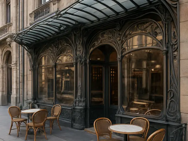
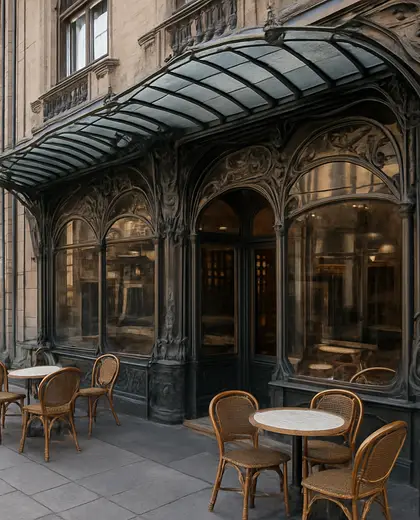
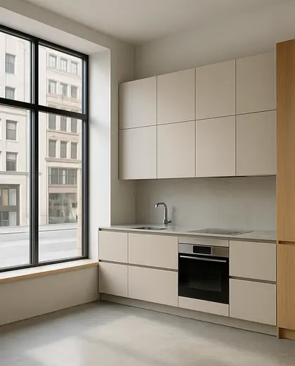
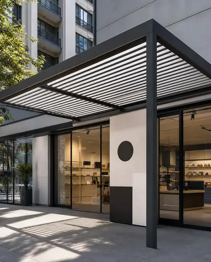
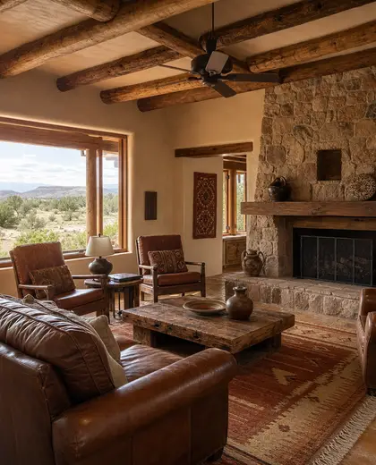
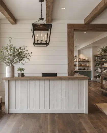
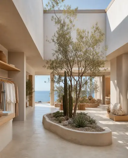
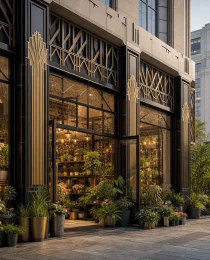
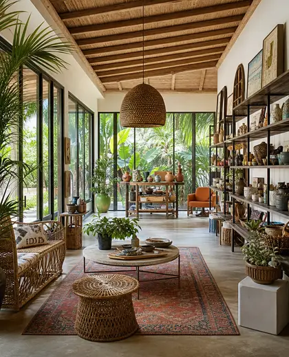
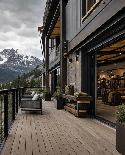
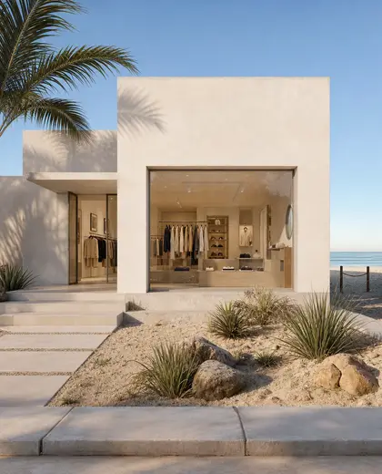
Store composition is typically built from durable, hard-wearing materials such as metal, glass, polished concrete, timber, and engineered stone. The palette is usually neutral and restrained, with white, black, grey, and natural wood tones supporting product displays and clear circulation. Defined by shelving, display plinths, integrated lighting, and an open, easy-to-read layout, it prioritizes function and visibility over ornament.
- store
— References
References to explore

What makes a store composition different from a regular interior?
It is organized around display, circulation, and visibility, so the layout and fixtures are more important than decorative layering.

Can a store composition feel warm rather than industrial?
Yes. Adding timber, softer lighting, textured wall finishes, and warmer neutrals can make it feel more inviting.
Does this composition work only for retail shops?
No. It also fits showrooms, pop-up spaces, galleries, and other spaces that need clear presentation and easy movement.
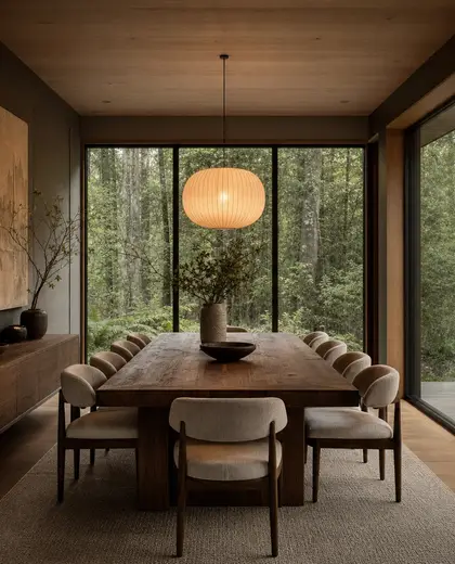
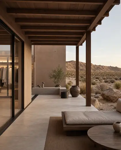
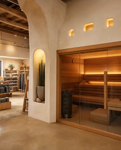
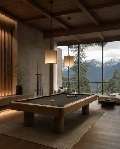
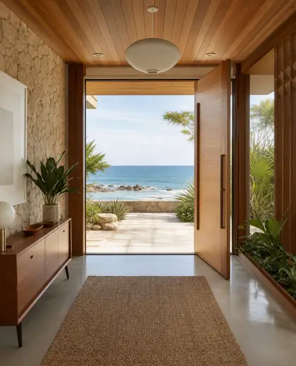
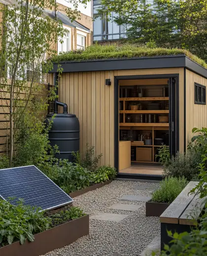
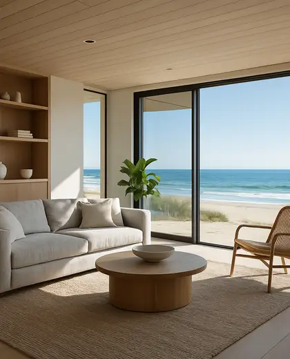
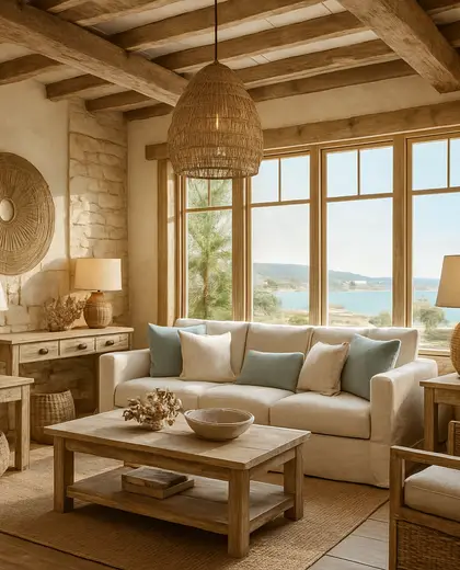
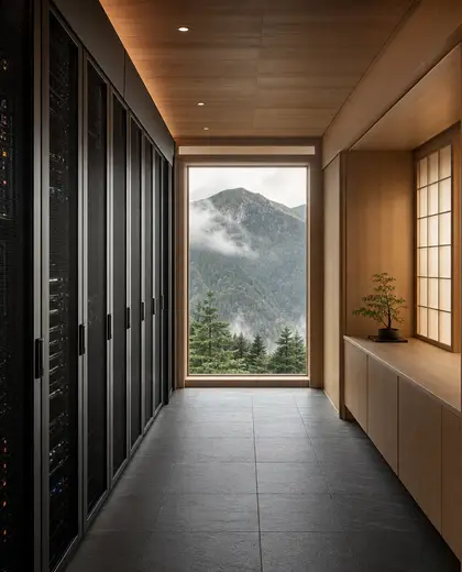
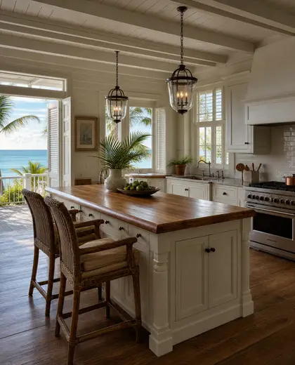
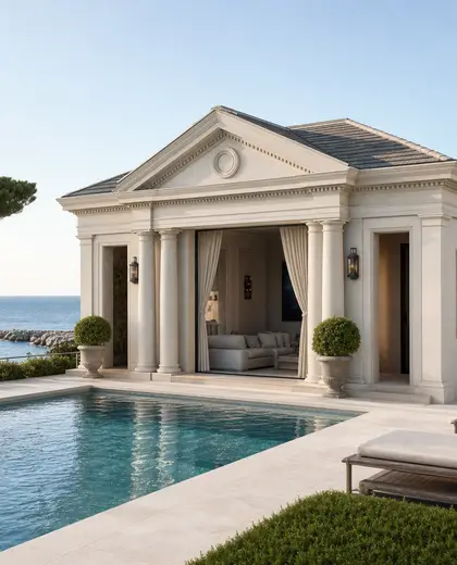
— The style
What defines it
Metal frames, glass fronts, timber shelving, polished concrete floors, and stone or laminate counters are common.
Usually neutral and clean: white, black, grey, warm wood, and occasional muted accent colors.
Works well with minimal lighting, large glazing, signage, custom joinery, and durable wall finishes.
— Professionals
Who has already built it
- aramitha devassykuttyarchitects · 6 projectsView profile →
- praveen kumar singh3d renderers · Ranchi · 6 projectsView profile →
- mawar electrical serviceselectricians · Bengaluru · 1 projectsView profile →
- anurag vermainterior designers · 6 projectsView profile →
— Questions
Frequently asked questions
What makes a store composition different from a regular interior?
It is organized around display, circulation, and visibility, so the layout and fixtures are more important than decorative layering.
Can a store composition feel warm rather than industrial?
Yes. Adding timber, softer lighting, textured wall finishes, and warmer neutrals can make it feel more inviting.
Does this composition work only for retail shops?
No. It also fits showrooms, pop-up spaces, galleries, and other spaces that need clear presentation and easy movement.